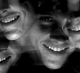
I finally got around to finishing my Web site and putting it up online. I wanted to make it somewhat malleable, so I put in a "recent" tab and a homepage, with a photo I can change periodically. It's simple, but I sometimes Web sites have too many bells and whistles that detract from the content. And my web language is confined to simple html and css.
Let me know what you guys think. Comments and suggestions are appreciated.
www.timhussin.com
3.08.2008
Subscribe to:
Post Comments (Atom)


8 comments:
Congrats on making your website. I need to do that sometime. I have postponed mine for awhile now.
Also, you may want to reposition the bottom border on the pages, it just bothers me that it doesn't have any space there, but that could just be me. Also, the links are a bit far down the page. And maybe consider having your contact info more readily available maybe with a mailto directly linking to your e-mail.
Congrats again on getting the website running. Hopefully this will inspire me to do the same.
Ah, I really like the addition of the "recent" section. It makes the site more living, so people feel engaged and have a reason to come back.
Good call by stripping away the bells and whistles, some sites with a lot of information or interactivity warrant it, but your content is completely visual. No distractions.
Where's that resume?
I like your site, the simple clean look is perfect, I think. Two things: in your recents (a great idea that I'll probably steal when I redesign), why did you put that icy school bus window picture in black and white? The color is so good. And also, the link to your blog is broken (it sends to timhussin.com/thussin.blogspto.com) easy fix. When you do fix, I think the blog should open in a new window rather than navigating away from your site (just insert target=_blank into the link code).
Excellent work, Tim. (We met at Keith's opening, I'm the other bald Mike.)
I like seeing that comments and suggestions left here are actually put to use (even if you opted not to have the blog link open in a new window).
Yeah, I took your advice. I want to make it open in a new window, but that means I have to change the code on every page. I'll get around to it sooner or later...
Looking really good dude. You're shooting really well out there and the site looks great. I might add some other stuff to your singles, I can think of a few shots you might have left out.
Awesome pictures....
i liked it....
___________________
Melvin
Call Today for NEXT DAY Instellation to watch your Favorite Channels on HD reciever.
Post a Comment